With this tutorial you can create different interfaces for different devices in same Virtual Tour.
All you need is a software for edit code, I advise you to use Atom, it’s free and very powerful, but even what you usually use is fine, you’ll have to edit only a few lines of code.
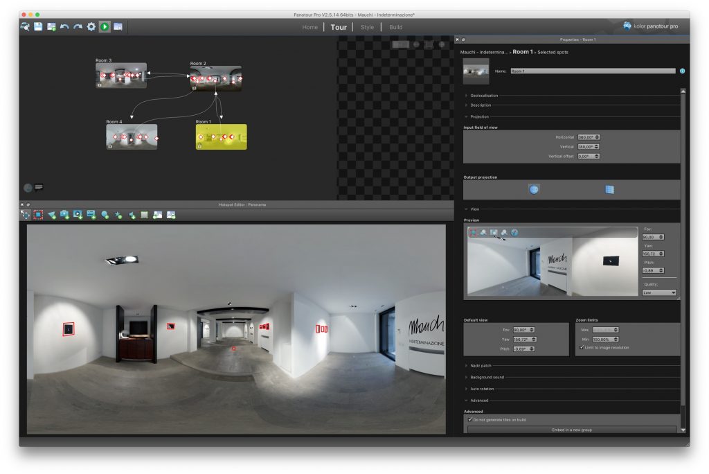
- First create the virtual tour by exporting it with Panotour Pro
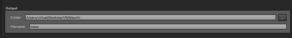
- After exported go to the project folder and change the name of the index_skin.xml file to index_skin_desktop.xml (note: the name before _skin.xml depends on the name you have set in Panotour Pro under Filename in Output
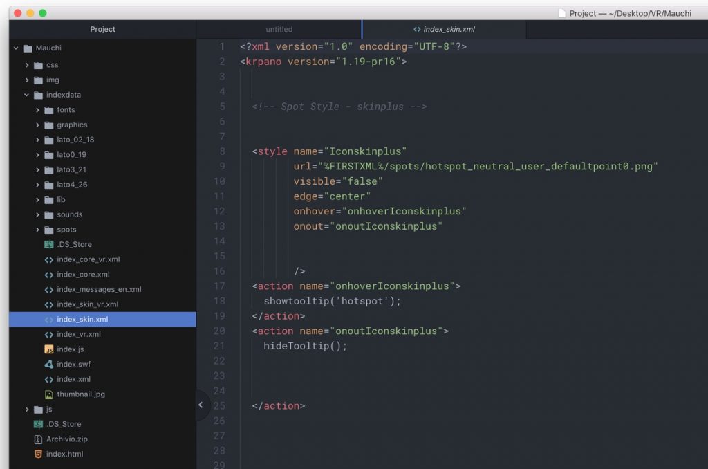
- If use Atom, you can open folder project and edit filename and code.
- Go back to Panotour Pro, make the changes you want to see on Mobile or Tablet, the changes you can make are only the graphics, move icons, change size, etc. (does not work with hotspots, tour changes, Scenes, general settings, etc.)
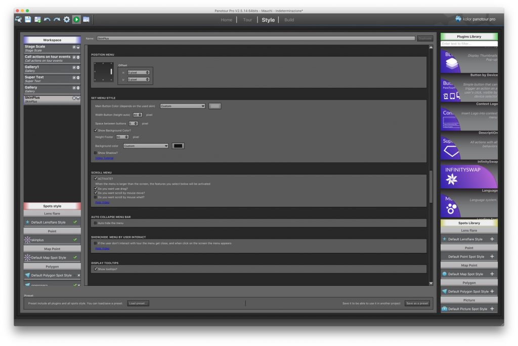
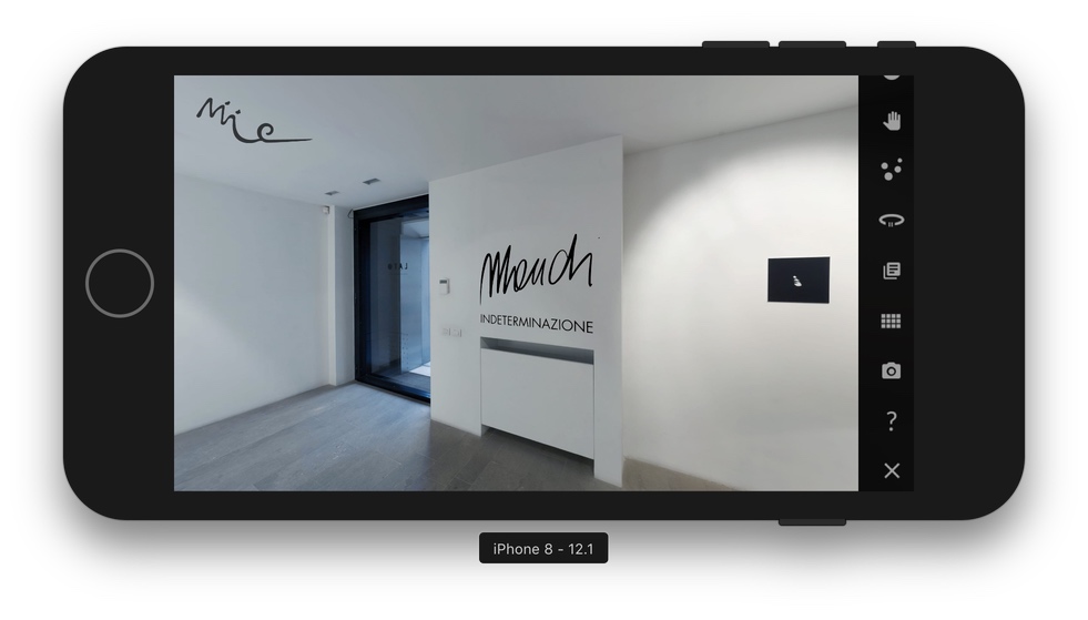
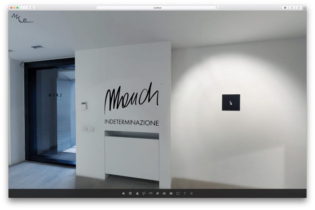
- In this example, I used the Skinplus (but it also works with the other menu bars), I have put menu vertical right for mobile.
- Export the project with the changes.
- Go back to the project folder and you will find again index_skin.xml change the name to index_skin_mobile.xml (remember step number 2)
- Now edit the index.xml file, look for the line of code
<include url = “%FIRSTXML%/index_skin.xml” /> - Change this line with this code
<include url = “%FIRSTXML%/index_skin_desktop.xml” devices = “desktop” />
<include url = “%FIRSTXML%/index_skin_mobile.xml” devices = “mobile|tablet” />
You can also decide to use the same desktop skin with a tablet then change the code with
<include url = “%FIRSTXML%/index_skin_desktop.xml” devices = “desktop|tablet” />
<include url = “%FIRSTXML%/index_skin_mobile.xml” devices = “mobile” />
Save and done you have 2 different skins
Beware, if you export the project with Panotour again all these changes will be deleted, and you will have to redo the whole procedure!
All devices supported by Krpano
| flash html5 |
Use only in the krpano Flash viewer. Use only in the krpano HTML5 viewer. |
| desktop normal tablet mobile handheld |
Use only on desktop devices. Use only on desktop and tablet devices. Use only on tablet devices. Use only on mobile devices. Use only on mobile and tablet devices. |
| css3d | Use only when CSS-3D-Transforms are available. |
| webgl | Use only when WebGL is available. |
| multiressupport | Use only when the browser is capable for multires. |
| panovideosupport | Use only when the browser is capable for panoramic video. |
| fullscreensupport | Use only when the Fullscreen mode is supported. |
| fractionalscaling | Use only when a fractional page-scale or pixelratio is set. |
| mouse | Use only on devices with mouse support. |
| touch | Use only on devices with Multi-Touch support. |
| ios | Use only on iOS devices (iPhone, iPod, iPad). |
| ios### | Use only when the iOS version is equal or higher than ###. |
| iphone ipod ipad |
Use only on the iPhone (and iPod Touch). Use only on the iPod Touch. Use only on the iPad. |
| android | Use only on Android devices. |
| androidstock | Use only in the old ‘stock’ (=WebKit-based) Android browser. Newer Android browsers are based on Chrome. |
| chrome chromemobile firefox ie edge safari |
Use only in the Chrome browser Use only in the Mobile Chrome browser (Android, Silk) Use only in the Firefox browser. Use only in the Internet Explorer browser. Use only in the Microsoft Edge browser. Use only in the Safari browser. |
| standalone | Use only in the Standalone Flashplayer. |
| windows mac linux |
Use only on Windows systems. Use only on Mac OSX systems. Use only on Linux systems. |